Friday 24 February 2012

Friday 10 February 2012
Feedback Directors
Excellent and considerate understanding of the technologies used in production of the video for example After effects and FCP.. There are evident links between creative decision making and use of technology on both productions of the video using professional digital cameras (e.g focus pulls) and in the post production editing process – in discussion of continuity. This is sustained and thorough and accurate in discussion of the art deco themes of the MV. The commentary shows a discrete awareness of the use of new media technology and uses discriminating examples really well in terms of graphic design and animation. Excellent command of terminology and well presented.
Covers sound and technology. Exemplifies After Effects well and the use of chromokey as an effect. Excellent commentary, well done.
Thursday 9 February 2012
Wednesday 8 February 2012
Task 4 - technology in pre production
New media technology was used throughout the process of the coursework, including pre production. This tchnology was important in assisting the research and planning throughout the process. For example, we used the internet on countless occassions to research into our chosen topic of the 20's. Obviously, internet sites such as youtube and google were particularly useful for researching other artists of that era and typical costume for poeple staring in our video.
| This is a link to sone advantages of using Google: http://www.brighthub.com/internet/google/articles/81403.aspx |
A pinical stage where we used new media technology in pre production was when we used the NX5 camera to shoot our pre visual animation storyboard. After sketching out our storyboards we filmed them before putting them onto final cut pro and syncing the images in time to the music. By doing doing this process we were able detect anything that we wanted to change before we shoot our final music video. Blogger was another Media technology that i used a lot throughout the process. Blogger was used as an online diary throughout the process but particularly in the stages of pre production as it enabled me to document everything that we decided to change or edit before making the final video. It also enabled me to maintain organisation in pre production so our concept was clear and accessable.
Development in technologies such as mobile phones were also particularly helpful throughout the process of pre production. We used an iphone to help us with the development of research and also to get photos of our cast members etc. This technology helped us to efficiently choose costumes for each person and remind ourselves as to what each person looked like. This media technology we found to be not only useful but also time saving. Instead of having to find professional camera and people to take picture we could simly do it ourselves, while also researching something on the internet at the same time.
All these examples of new media technologies made our pre production process much easier and more efficient.
Wednesday 1 February 2012
Media Technology in digipak and poster.
When creating our CD digipak and poster we had to first take a set of photographs that we could then edit to create our final products. We took these pictures on a Cannon 500D to catch high quality pictures that we could then play around with to create a final image representing our artist.
We used the program PhotoShop to edit our pictures. We needed to create a 6 panel CD digipak and an advertisment poster to compliment our pop promo video. Photoshop is a image manipulation device which allows us to create new images from outstanding ones. How To Use PhotoShop

We chose the images we wanted for our products and then started work first on the CD digipak. We got a template from the internet of a 6 panel CD pack and then layered the images up against this. We edited 4 pictures on their own before adding them to the template. The main image for us to edit was the front cover which we did by selecting the picture and then cropping it to fit the square frame. We then duplicated the layer to enable us to airbrush the image of our artist to create a flawless 1920's look. We created another layer to add the text in which we were able to choose the font of our choice for our artist. We chose a font that we wanted throughout the ancillary texts to create a sense of synergy. We got pictures of art deco frames and lines which we added ontop of our own photos to highlight the 1920's era and link the text back to our video. We then used the colour manipulation tools to alter the lighting and contrast of the image to look like the colours we used in the video. We did similar things for the other panels where we used the 'eye dropper' tool to choose a colour from our video and then place this on the panel.
 When creating our poster we chose to follow the idea of one of our digipak panels which would create a sense of synergy. We used the eye dropper tool to select the same colour as the panel and then chose the same silhouette image of the dancer to place on our poster. We did this by using the marquee tool to draw around one of the three silhouettes and then copy and paste it onto the poster. We then used the transform tool to scale it to the size we wanted. And added the same font in the similar positioning on the poster as on the digipak. We created a new layer to add text to the poster which included tour dates where the artist would be performing. We saved images of the twitter and FaceBook logo to place on the bottom of the poster in their own layers and then found a barcode on google to place ontop of the poster. Once we had created it we though somethig was missing so we added a new layer and used the brush tool to add a signiture of the artist in a similar colour as what would be found in the video, over the top of the silhouette.


We used the program PhotoShop to edit our pictures. We needed to create a 6 panel CD digipak and an advertisment poster to compliment our pop promo video. Photoshop is a image manipulation device which allows us to create new images from outstanding ones. How To Use PhotoShop

We chose the images we wanted for our products and then started work first on the CD digipak. We got a template from the internet of a 6 panel CD pack and then layered the images up against this. We edited 4 pictures on their own before adding them to the template. The main image for us to edit was the front cover which we did by selecting the picture and then cropping it to fit the square frame. We then duplicated the layer to enable us to airbrush the image of our artist to create a flawless 1920's look. We created another layer to add the text in which we were able to choose the font of our choice for our artist. We chose a font that we wanted throughout the ancillary texts to create a sense of synergy. We got pictures of art deco frames and lines which we added ontop of our own photos to highlight the 1920's era and link the text back to our video. We then used the colour manipulation tools to alter the lighting and contrast of the image to look like the colours we used in the video. We did similar things for the other panels where we used the 'eye dropper' tool to choose a colour from our video and then place this on the panel.


We also created a few different posters in photoshop that we decided we didnt want to use as our final poster. These followed the same similar ideas as the final poster, we just used the colour contrast and highlighter tool to get the block effects which we then selected and added different colurs to.


Friday 27 January 2012
Feedback on Evaluation Task Two -The Campaign
I feel that your presentation covers many of the core points but also has absent detail to the arguments that you want to make in particular in relation to the star image and branding in the campaign. Also you need to discuss the campaign in relation to its marketing mix. The evaluation should include how successful you think you were and give some indication of product placement. I was expecting the presentation to be a minimum of 12 slides. Can you redraft and complete your work by next Wednesday.
Thank you
Thank you
Feedback on Task three
Can you please post your audience feedback over the weekend? ANd address Evaluation Task three.
Monday 23 January 2012

Sunday 22 January 2012
Saturday 14 January 2012
Feedback
Well presented PPT. You do need to address the set question, which is absent from the presentation. You are being asked to evaluate the use, development or challenges to media conventions. You also need to include a wider range of exemplified links to real media products.
We spent a lot of time reading of the conventions used in music video which I feel that you have not really cited in your blog entry. Can you please ensure that you do so when redrafting evaluation task 1.
We spent a lot of time reading of the conventions used in music video which I feel that you have not really cited in your blog entry. Can you please ensure that you do so when redrafting evaluation task 1.
Friday 13 January 2012
Sunday 27 November 2011
Feedback
Sound what you have completed, but not a full evaluation as expected. You have provided a good treatment, but not fully addressed all the set questions - particularly on audience feedback. You will need to go back over this work - I know that you have been putting in lots of effort on the music video, but you need to complete your blogging tasks.
Friday 25 November 2011
Treatment and Evalutaion of CD digipak
CD Digipak Treatment:
Idea 1:
We are going to have four different images, ond for the front cover one for the back and one for each of the inside overs. The front cover will be an image of our main girl dressed in her 1920's style costume and it will be an extreme close up of her face. We will edit it to make it look more authentic, belonging to the 1920's era, but also pick out some key colours like the green in the background just to demonstrate that we are mixing it with todays culture, which markets our brand well.
The back cover will be of our main girl on the set of the shoot and with her will be the dancers sitting on the steps. It similarly will be be photoshopped to add a more 20's style and modern day twist to it. We will also add the conventions found on the back of a digipak such as the bar code and the copyright details.
CD Digipak Evaluation:
When designing our digipak we came up with many different ideas of the style we wanted. Obviously with our idea of our brand image being old mixed with new we wanted this to be portratyed through the digipak so audiences would instantly recognise this. Our initial idea was to have two differenet images on the front and back of the cover, however, after experimenting with this we decided that it looked a little disjointed and not really like one digipak. We particularly liked the look of the front cover that we made however, and were adimant to use if for our final cover as the image after photoshopping it really captured the idea of 1920's style but also had an elements of the new in it aswell. Looking over the pictures from the photoshoot we did, we realised that there weren't any pictures which matched the qualitly of the one we wanted to use for our front cover, so we then looked elsewhere for inspiration.
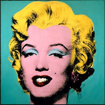
While looking at other CD's we came across Maddona's album cover of Celebration inspired by Andy Warhol's pop art. We decided that this album cover was similarly displaying the old and the new.

With further research into similar designs we came across Michael Jacksons album invinsable as recognised that he had used a similar design to that of warhol's work, making it look edgy and stand out.
After looking at the work of these two very influencial artists we decided that perhaps we could use this fro our digipak design using the one image that we all agreed was the best. After several hours experimenting with the photo in photoshop, this was the design which we felt really captured our attention and marketed our brand very clearly and artistically.

Tuesday 22 November 2011
Monday 21 November 2011
List of shots from the Shoot day
Throughout the shoot day we were able make a list of all the shots that we made. This enabled us to know which shots were good and also allowed us to establish if we needed more of a particualr shot etc.
Part 1 - Opening Dance
- Two guys freestyle (Blue Background)
- Ben Close Up (Blue Background)
- Tunde Close Up (Blue Background)
- Tunde Extreme Close Up (Blue Background)
- Ben Extreme Close Up (Blue Background)
- Tunde Mid Close Up (Green Screen)
- Ben Mid Close Up (Green Screen)
- Ben Wide Shot Low (Green Screen)
- Tunde Wide Shot Low (Green Screen)
- Connor Wide (Green Screen)
- Connor Wide (Green Screen)
- Mid Close Up Ben (Green Screen)
- Mid Close Up Tunde (Green Screen)
- Close Up Miles (Green Screen)
- Miles Wide Shot (Green Screen)
- Mile Wide Shot Right (Green Screen)
- Miles Close Up Shoes (Green Screen)
- Georgina Wide Shot (Green Screen)
- Georgina Close Up (Green Screen)
- Georgina Close Up Shoes (Green Screen)
- Connor Tap Close Up (Green Screen)
Part 2 - Old Skool
- Two guys clicking (Blue Background)
- Ben Close Up (Blue Background)
- Tunde Close Up (Blue Background)
- Tunde Extreme Close Up (Blue Backround)
- Ben Extreme Close Up (Blue Background)
- Tunde Mid Close Up (Green Screen)
- Ben Mid Close Up (Green Screen)
- Ben Wide Shot Low (Green Shot)
- Tunde Connor Wide (Green Screen)
- Wide Shot Low (Green Screen)
- Connor Wide (Green Screen)
- Conner Wide (Green Screen)
- Mid Close Up Ben (Green Screen)
- Mid Close Up Tunde (Green Screen)
- Miles Mid Left (Green Screen)
- Miles Mid Right (Green Screen)
- Miles Mid Straight (Green Screen)
- Miles Mid Both Sides (Green Screen)
- Miles Wide Shot (Green Screen)
- Miles Wide Shoot Right (Green Screen)
- Miles Close Up Shoes (Green Screen)
- Georgina Wide Shot (Green Screen)
- Georgina Close Up (Green Screen)
- Georgina Close Up Shoes (Green Screen)
- Connor Tap Close Up (Green Screen)
Part 3 - Dance
- Two guys feet kicking (Blue Background)
- Ben Close Up (Blue Background)
- Tunde Close Up (Blue Background)
- Tunde Extreme Close Up (Blue Background)
- Ben Extreme Close Up (Blue Background)
- Tunde Mid Close Up (Green Screen)
- Ben Mid Close Up (Green Screen)
- Ben Wide Shot Low (Green Screen)
- Tunde Wide Shot Low (Green Screen)
- Connor Wide (Green Screen)
- Connor Wide (Green Screen)
- Mid Close Up Ben (Green Screen)
- Mid Close Up Tunde (Green Screen)
- Miles Wide Shot (Green Screen)
- Miles Wide Shoot Right (Green Screen)
- Miles Close Up Shoes (Green Screen)
- Georgina Wide Shot (Green Screen)
- Georgina Close Up (Green Screen)
- Georgina Close Up Shoes (Green Screen)
- Connor Tap Close Up (Green Screen)
Part 4 - Old Skool break
- Tunde Close Up (Blue Background)
- Tunde Extreme Close Up (Blue Background)
- Ben Extreme Close Up (Blue Background)
- Tunde Mid Close Up (Green Screen)
- Ben Mid Close Up (Green Screen)
- Ben Wide Shot Low (Green Screen)
- Tunde Wide Shot Low (Green Screen)
- Connor Wide (Green Screen)
- Connor Wide (Green Screen)
- Ben Cane
- Mid Close Up Ben (Green Screen)
- Mid Close Up Tunde (Green Screen)
- Mid Close Up Tunde MIC (Green Screen)
- Miles Mid Trumpet Flip (Green Screen)
- Miles Close Trumpet Flip (Green Screen)
- Miles Wide Shot (Green Screen)
- Miles Wide Shot Right (Green Screen)
- Miles Close Up Shoes (Green Screen)
- Georgina Wide Shot (Green Screen)
- Georgina Mid Close Up (Green Scren)
- Georgina Close Up (Green Screen)
- Georgina Close Up Shoes (Green Screen)
Part 5 - DANCE
- Tunde Close Up (Blue Background)
- Tunde Extreme Close Up (Blue Background)
- Ben Extreme Close Up (Blue Background)
- Tunde Mid Close Up (Green Screen)
- Ben Mid Close Up (Green Screen)
- Ben Wide Shot Low (Green Screen)
- Tunde Wide Shot Low (Green Screen)
- Connor Wide (Green Screen)
- Connor Wide (Green Screen)
- Mid Close Up Ben (Green Screen)
- Mid Close Up Tunde (Green Screen)
- Miles Wide Shot (Green Screen)
- Miles Wide Shot Right (Green Screen)
- Miles Close Up Shoes (Green Screen)
- Georgina Wide Shot (Green Screen)
- Georgina Close Up (Green Screen)
Part 6 - Break Short Old School
- Tunde Close Up (Blue Background)
- Tunde Extreme Close Up (Blue Background)
- Tunde Mid Close Up (Green Screen)
- Ben Mid Close Up (Green Screen)
- Ben Wide Shot Low (Green Screen)
- Tunde Wide Shot Low (Green Screen)
- Connor Wide (Green Screen)
- Connor Wide (Green Screen)
- Mid Close Up Ben (Green Screen)
- Mid Close Up Tunde (Green Screen)
- Miles Wide Shot (Green Screen)
- Miles Wide Shot Right (Green Screen)
- Miles Close Up Shoes (Green Screen)
- Georgina Wide Shot (Green Screen)
- Georgina Mid Shot (Green Screen)
- Georgina Close Up (Green Screen)
Part 7 - Dance
- Tunde Close Up (Blue Background)
- Ben Extreme Close Up (Blue Background)
- Tunde Mid Close Up (Green Screen)
- Ben Mid Close Up (Green Screen)
- Ben Wide Shot Low (Green Screen)
- Tunde Wide Shot Low (Green Screen)
- Connor Wide (Green Screen)
- Connor Wide (Green Screen)
- Mid Close Up Ben (Green Screen)
- Mid Close Up Tunde (Green Screen)
- Miles Wide Shot (Green Screen)
- Miles Wide Shot Straight On (Green Screen)
- Georgina Wide Shot (Green Screen)
- Georgina Mid Shot (Green Screen)
- Georgina Close Up (Green Screen)
Part 8 - Old School Outro
- Tunde Close Up (Blue Background)
- Ben Extreme Close Up (Blue Background)
- Tunde Mid Close Up (Green Screen
- Ben Mid Close Up (Green Screen)
- Ben Wide Shot Low (Green Screen)
- Tunde Wide Shot Low (Green Screen)
- Connor Wide (Green Screen)
- Connor Wide (Green Screen)
- Mid Close Up Ben (Green Screen)
- Mid Close Up Tunde (Green Screen)
- Miles Wide Shot (Green Screen)
- Miles Wide Shot Straight On (Green Screen)
- Georgina Wide Shot (Green Screen)
- Georgina Close Up (Green Screen)
Saturday 19 November 2011
Feedback
You have blogged a very good account of the production day which is fully reflective on process. I think you clearly understood the production process and shot selection. I would like to see more on the technical side of the shoot, for example, comments on the technologies used. You do need to present your images n a better way - use a slide show, for example. you also ned to post your CD digipak and evaluate this.
Wednesday 16 November 2011


Tuesday 15 November 2011
Evaluation of shoot day
At the beginning of the day we started by getting all of our actors into their costumes, making them look as of the 1920's period as we could. I feel that, by putting a lot of time into the costume we were able to create much more of a realistic and authentic looking video.
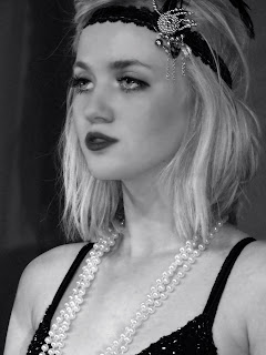
The image below of Georgie, who was our main girl, I feel conveys a 1920s style, demonstrated through the head band which she wears, which is very stereotypical of 1920's woman. In addition to this, the pearls around her neck also help to determine the period of the piece. The preparation that we put into the consumes helped towards making the day run smoother.
When we first started shooting, i think it is fair to say we were all a little apprehensive as to how the day was going to shape itself and whether of not it was going to be a success due to the preservations of our idea a few days earlier. The first few shots we did were of our dancers. I believe the general feeling in the morning was anxiousness, which unfortunately affected our dancers for a small part of the morning. Upon reflection i would say that as a result of our nervousness it was exposed the dancers, making them perhaps feel uncomfortable. However, after we had a group meeting we decided to be much more positive making the overall vibe of cast and crew much better. This therefore enabled our dancers to become much more relaxed and they performed tremendously for the rest of their time. Being natural dancers they provided most of the moves themselves, however, there were parts which we wanted specific moves, performed. For example, we wanted to have one particular shot in silhouette in which one person would pass a cane down a line. We struggled here with making the movement look smooth as we wanted the cane to be swirled in the middle as it was being passed down, therefore it took more time due to practicing it. However, the shot turned out the way we wanted it in the end.
In the morning our main focus was shooting things to be transferred into silhouette. Each of the shots we did against a green screen and we found that our division of labour worked well as we were all assigned different roles. I was the director for the main part of the morning however, we did change our roles around and i was able to operate the camera and also be on playback. Other shots we got in the morning, were those of the trumpet, which we managed to get a hold of and silhouettes of our main girl. We were fortunate enough to have a teacher who could play the trumpet, which we all felt really added to the authenticity of the shot. These were all successful shots and we used a diverse range of shot types such as mid shots and close up shots giving us lots of options as to which looked the best and most fitting for our music video. By the end of the morning we had finished shooting the boys and this meant that by the afternoon we were able to focus on shooting our main protagonist. By diving our time like this it mean that our cast member also didn't have to do a huge lot of waiting around for their turn to be shot, instead it was efficient and we didn't take up all their time.
After a short lunch we resumed shooting with and started with our dancers. Similarly to the morning we spent a bit of time sorting the girls into appropriate costumes while the other half of our group rearranged our set for the afternoon. We spent 10 minutes or so going over the dance with the girls before starting to shoot them, refreshing them of the moves we wanted them to do. As the energy was much better among our group they fell into the mood of the shoot much quicker than the boys in the morning, giving a really solid performance. We got lots of different shots of the dancers giving it a much more dynamic look, for example shots of their waist etc. These shots lead on to the tracking shot we did of our main girl, Georgie.
Georgie's look as a performer has a very obvious 1920's sophisticated style to it which we found after doing screen shots a couple of months prior to our shot - this was perfect for our video. The tracking shot which we wanted to do was of Georgie walking down stairs and singing into the camera. However, the idea proved to be slightly easier that the execution. Some of the things we encountered when doing the shot was keeping it in focus and at the same time tracking back. However, after a few failed attempts and trivial matter such as the track being slightly off centre were soon rectified as we were able to create the shot we wanted and it looked just the way we imagined. This again was a similar situation for our second tracking shot however, like before we succeeded in the challenge.
Overall the day i feel through a few obstacles at us but we tackled them full on and i think due to the positive attitude throughout the day and the standard of performing, we were able to get some shots which we were all really happy with and I believe will make a good music video after the editing process has finished.
The image below of Georgie, who was our main girl, I feel conveys a 1920s style, demonstrated through the head band which she wears, which is very stereotypical of 1920's woman. In addition to this, the pearls around her neck also help to determine the period of the piece. The preparation that we put into the consumes helped towards making the day run smoother.

When we first started shooting, i think it is fair to say we were all a little apprehensive as to how the day was going to shape itself and whether of not it was going to be a success due to the preservations of our idea a few days earlier. The first few shots we did were of our dancers. I believe the general feeling in the morning was anxiousness, which unfortunately affected our dancers for a small part of the morning. Upon reflection i would say that as a result of our nervousness it was exposed the dancers, making them perhaps feel uncomfortable. However, after we had a group meeting we decided to be much more positive making the overall vibe of cast and crew much better. This therefore enabled our dancers to become much more relaxed and they performed tremendously for the rest of their time. Being natural dancers they provided most of the moves themselves, however, there were parts which we wanted specific moves, performed. For example, we wanted to have one particular shot in silhouette in which one person would pass a cane down a line. We struggled here with making the movement look smooth as we wanted the cane to be swirled in the middle as it was being passed down, therefore it took more time due to practicing it. However, the shot turned out the way we wanted it in the end.
In the morning our main focus was shooting things to be transferred into silhouette. Each of the shots we did against a green screen and we found that our division of labour worked well as we were all assigned different roles. I was the director for the main part of the morning however, we did change our roles around and i was able to operate the camera and also be on playback. Other shots we got in the morning, were those of the trumpet, which we managed to get a hold of and silhouettes of our main girl. We were fortunate enough to have a teacher who could play the trumpet, which we all felt really added to the authenticity of the shot. These were all successful shots and we used a diverse range of shot types such as mid shots and close up shots giving us lots of options as to which looked the best and most fitting for our music video. By the end of the morning we had finished shooting the boys and this meant that by the afternoon we were able to focus on shooting our main protagonist. By diving our time like this it mean that our cast member also didn't have to do a huge lot of waiting around for their turn to be shot, instead it was efficient and we didn't take up all their time.
After a short lunch we resumed shooting with and started with our dancers. Similarly to the morning we spent a bit of time sorting the girls into appropriate costumes while the other half of our group rearranged our set for the afternoon. We spent 10 minutes or so going over the dance with the girls before starting to shoot them, refreshing them of the moves we wanted them to do. As the energy was much better among our group they fell into the mood of the shoot much quicker than the boys in the morning, giving a really solid performance. We got lots of different shots of the dancers giving it a much more dynamic look, for example shots of their waist etc. These shots lead on to the tracking shot we did of our main girl, Georgie.
Georgie's look as a performer has a very obvious 1920's sophisticated style to it which we found after doing screen shots a couple of months prior to our shot - this was perfect for our video. The tracking shot which we wanted to do was of Georgie walking down stairs and singing into the camera. However, the idea proved to be slightly easier that the execution. Some of the things we encountered when doing the shot was keeping it in focus and at the same time tracking back. However, after a few failed attempts and trivial matter such as the track being slightly off centre were soon rectified as we were able to create the shot we wanted and it looked just the way we imagined. This again was a similar situation for our second tracking shot however, like before we succeeded in the challenge.
Overall the day i feel through a few obstacles at us but we tackled them full on and i think due to the positive attitude throughout the day and the standard of performing, we were able to get some shots which we were all really happy with and I believe will make a good music video after the editing process has finished.
Sunday 16 October 2011
Feedback
Excellent posts - fully reflective and evident evaluation. You have clear reserach and planning for your product and able to offer individual insight and comment. Well done.
There are one or two ways to develop the blog. First to begin using a wider range of blogging tools - there are lots of well presented images, but use of Flickr or powerpoint will increase the creativity that is shown on your blog. Images on the posts are good, but could be better if you started to use presentational tools
Second the valid, detailed and reflective comments that you make need to be developed further with key media concepts and theoretical ideas; for example, link the planning to star image, or how set design and lighting link to mise en scene and/ or what model's of lighting you are using in relation to your set - key, fill, directional, discuss the untensity and colour and what you are trying to represent about your artist. This will help make a more thorough evaluation of your work.
Friday 14 October 2011
Shooting list
08:30 AM: Gather cast and crew and talk through day
08:45 AM: Get into Costume/Makeup (Heather)
09:00 AM: Set up camera/tripod e.t.c
09:15 AM: Start shooting close ups of Lead Singer
09:30 AM: Start shooting wide shots of Lead Singer
09:45 AM: Shoot the Zoetrobe (Close Ups/Mid Close Ups/Wide Shots)
11:00 AM: Wide Shots of Dancers on black rostra.
11:15 AM: Mid Shots of Dancers on black rostra.
11:30 AM: Dolly shots of Dancers on black rostra.
11:55 AM: Sillhouettes of Lead singer (poses against white backdrop)
12:15 AM: Breaking jewellary (Lead singer) to be reversed in post
12:30 AM: Coins falling to be reversed in post
12:45 AM: Lunch Break
12:45 AM: Lunch Break
01:20 PM: Finish Lunch and meet back in studio to get back into costume e.t.c
01:25 PM: Shoot Gramaphone with record on.
01:35 PM: Shoot DJ Decks and scratching.
01:50 PM: Shoot sillouettes (Mulitply slowly in post) against white.
02:15 PM: Ben & Tunde cleaning shoes (Close Up/Mide Shot)
02:30 PM: Roullette wheel spinning (be reversed in Post)
02:45 PM: Chair Crashing to the floor
02:55 PM: Shot of China Plates Falling and Smashing (Plates/mugs/glasses e.t.c)
Thursday 13 October 2011
Set Sketchs and Initial Lighting Ideas

The image above is of a zoetrope which we want to recreate in our music video.

This image suggests what we want our band to look like. We have also included the lighting design, to show a clear representation of what we want our set to look like.

Above we have drawn an image of a shillouet on a platform and annotated it suggesting what needs to be done in post production.

The drawing above shows a clear idea of what we want our lead girl to look like and the lighting we think would be appropriate.

This final image shows a basic layout of what we want the space to look like. Obviously it is very basic as we feel this would compliment the look of our video best.
Wednesday 12 October 2011
Further Research into a Zoetrope
After researhing into our new idea, we looked at examples of zoetropes because we needed to expand our understanding of what the look is that we are going for in our video. We looked at verious videos on youtube to get a more sound idea of what how it works. Below is a short video of how a zoetrope actually works:
We found this video below of the sony bravia advert which is the largest zoetrope that has ever been made in the world. Obviously we realise that our version wouldn't be as impressive as this, however, we hope that we can creat this general feeling that they have captured in the advert:
We found this video below of the sony bravia advert which is the largest zoetrope that has ever been made in the world. Obviously we realise that our version wouldn't be as impressive as this, however, we hope that we can creat this general feeling that they have captured in the advert:
We also looked at examples of zoetropes and how they can be used in music video or in time with music. This video below we found to be particuarly useful as a starting point for our idea:
Evaluation of Animatic
Obviously we storyboared our ideas for our music video and created a shot by shot plan of what we wanterd every shot to look like. After doing this we decided to film the storyboards and put them into an animatic, where by we were able to edit them according to the music essentually creating a music video through drawings. We also found this experience a usful one as we were able to cut the clips in time to the beat of the song which is ultimatley what we want to achieve when creating the real video, so we got a head-start! When editing the video though it made us re-think some of our shot choices for the final thing, especially those which we had used for our narrative. We felt that perhaps they were a bit cliche and looking at them with the song this reienforced this idea. However, we decied we should continue with the process and thing again aferwards and maybe change them on our shoot day if we are still feeling unsure.
When we came to complete the whole animatic. We watched it back and with feed back from Luke and Matt, we decided that the narative didn't make a lot of sense and it looked a bit messy. So we decided to go back to the drawing board and think of possible narratives. We came up with ideas such as woman domination perhaps. This would work well in relation to the lyrics of the song, however i think we all felt that we wanted to stick with our original concept of race segregation. Instead of using our initial idea of an all female band we decided that to convey our concept more clearly we could have black men in the background with a white woman being the center and then demonstrate segregation this way. However, we felt that having men pretending to play instruments especially thinks like the trumpet it could look very aminuture-ish. We then contimplated contacting local music colleges to see if there were any real musicians. Eventually however, we came up with the idea of using a zoetrope, and maybe collecting images of real black 1920s performer and using them as still images which move with the zoetrope.
Overall i think it is fair to say that the animatic wasn't hugely successful on our part but we what i feel that we did get from it was a good experience of how to edit to music. We were also able to generate lots of idea which can only improve our final piece, which we feel is only a step in the right direction!
Tuesday 11 October 2011
Costume list
1920's elaborate/expensive/illusive dress (central character)inc. hat.
2 lower class working outfits
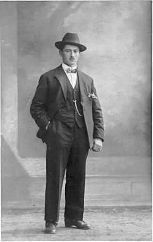


2 lower class working outfits
Upper class gentlemen’s suit
2 middle class Suits
1920's middle class women’s dress x 3

Subscribe to:
Posts (Atom)