CD Digipak Treatment:
Idea 1:
We are going to have four different images, ond for the front cover one for the back and one for each of the inside overs. The front cover will be an image of our main girl dressed in her 1920's style costume and it will be an extreme close up of her face. We will edit it to make it look more authentic, belonging to the 1920's era, but also pick out some key colours like the green in the background just to demonstrate that we are mixing it with todays culture, which markets our brand well.
The back cover will be of our main girl on the set of the shoot and with her will be the dancers sitting on the steps. It similarly will be be photoshopped to add a more 20's style and modern day twist to it. We will also add the conventions found on the back of a digipak such as the bar code and the copyright details.
CD Digipak Evaluation:
When designing our digipak we came up with many different ideas of the style we wanted. Obviously with our idea of our brand image being old mixed with new we wanted this to be portratyed through the digipak so audiences would instantly recognise this. Our initial idea was to have two differenet images on the front and back of the cover, however, after experimenting with this we decided that it looked a little disjointed and not really like one digipak. We particularly liked the look of the front cover that we made however, and were adimant to use if for our final cover as the image after photoshopping it really captured the idea of 1920's style but also had an elements of the new in it aswell. Looking over the pictures from the photoshoot we did, we realised that there weren't any pictures which matched the qualitly of the one we wanted to use for our front cover, so we then looked elsewhere for inspiration.
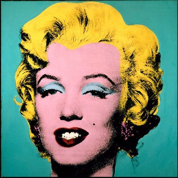
While looking at other CD's we came across Maddona's album cover of Celebration inspired by Andy Warhol's pop art. We decided that this album cover was similarly displaying the old and the new.

With further research into similar designs we came across Michael Jacksons album invinsable as recognised that he had used a similar design to that of warhol's work, making it look edgy and stand out.
After looking at the work of these two very influencial artists we decided that perhaps we could use this fro our digipak design using the one image that we all agreed was the best. After several hours experimenting with the photo in photoshop, this was the design which we felt really captured our attention and marketed our brand very clearly and artistically.

No comments:
Post a Comment